Between May – August of 2016 I served as a User Experience Researcher at Vectorform, a Detroit Software Design company. I worked on three projects. One for a mobile company, one for a health company, and a virtual reality project for DTE, each of which are covered under NDA.
MOBILE
For a re-design, I began competitive research and analysis to identify areas of growth for our client. Afterwards, I organized an affinity wall brainstorming session with the Design, Marketing, and Engineering team alongside our clients. This affinity wall session allowed us to ideate effectively across teams and solidify goals. This work resulted in wireframes, which were translated to high-fidelity prototypes on InVision. I specifically focused on the architecture of the project, as well as the sign-up process.

HEALTH
My work with our health client began again with competitive research and analysis. This analysis identified ways for our Health client to better organize their services while keeping a modern feel. This was translated in a report presented to our first official client meeting. I also created a sitemap and userflow. The sitemap covered over 7,000 pages of the entire site, which identified redundancies in site organization.


VIRTUAL REALITY
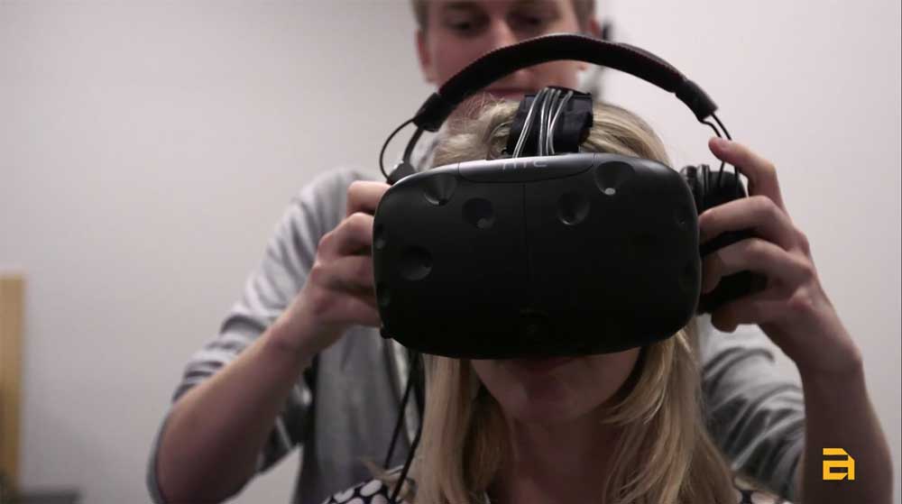
I was the primary UX Researcher for our work with DTE. We created a virtual-reality based training program for current and new employees. This project was designed as an example of the possibilities of VR for their team. Before starting this project, I outlined company best-practices for user experience and design in VR.
I began with six user-interviews of team leaders, linemen, and on-site repair employees. These interviews identified the needs and frustrations DTE’s current training program. We then proceeded with an on-site study of DTE employees, traveling to one of their training headquarters and viewing roof-work. Our observations and pictures were translated directly into the environment design of our final product.
Finally, I organized three user tests from our six user interviews, alongside three more casual user tests within the company. Each of these tests were recorded. Observations from these user tests resulted in minor redesigns to the UI and interaction mechanisms.


