design revamp
The entirety of my UX division I joined was no older than 6 months of time within The Company. To get up to speed as quickly and collaboratively as possible, we began with reviewing the past design decisions made before our time in order to understand the dependencies and logic of Thomson Reuter’s competitive strategy. We also analyzed competitors to ensure we broadened our scope of possibilities.
One of our products is extremely large. Some may refer to it as “Enterprise Software.” As a team we organized designs by patterns, and weekly reviewed, critiqued, and created a backlog of goals and recommendations for the team. This ensured that our decisions were made as a group, so if any product owner, systems analyst, or developer could refer to any team member for insight and reasoning. It allowed us to keep track of items that needed to be updated in order to keep our product competitive, while also continuing to design for future tools.

style guide
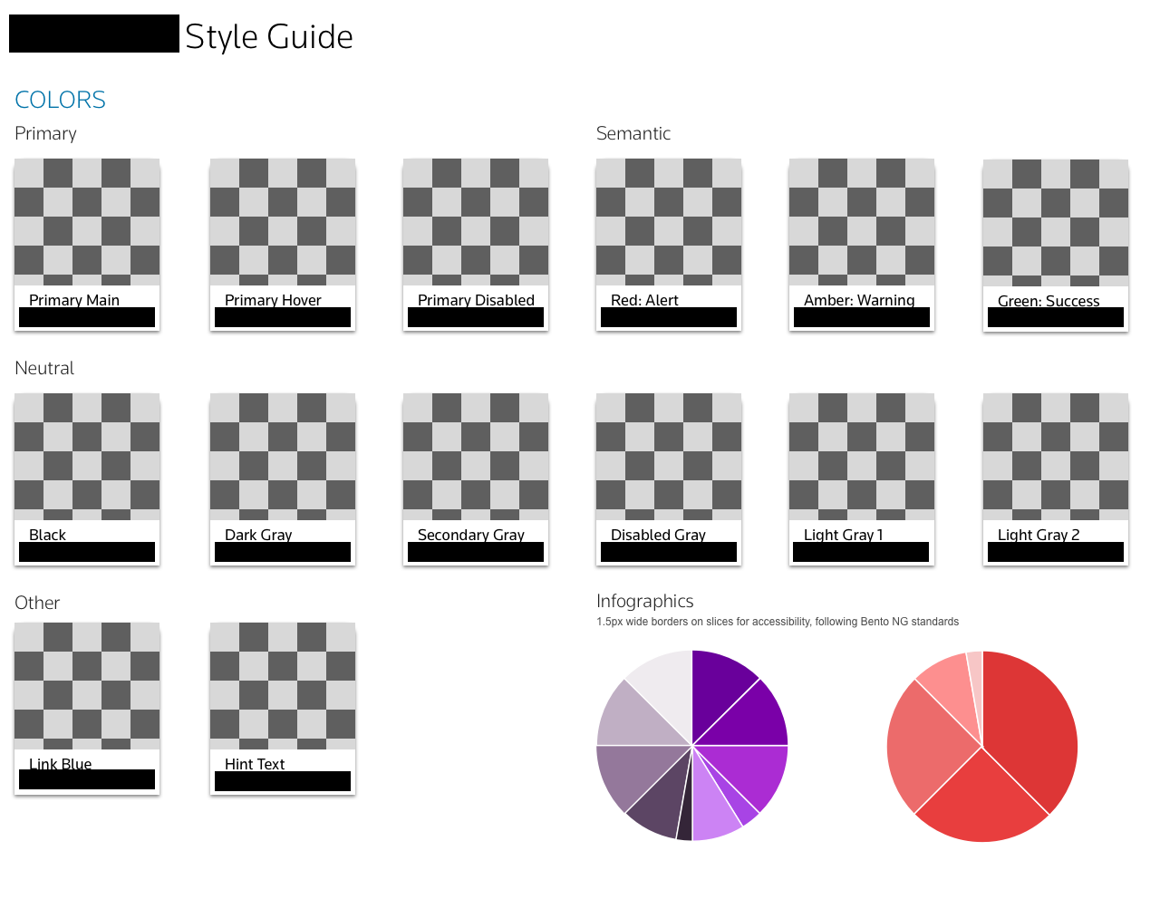
One of the products I worked on was developed extremely fast – so much so, that the previous team did not have an opportunity to create a style guide. Thankfully, it was created with an overall vision, which I was able to use to develop a style guide. I had our team adopt the 8 point system to ensure spacing was accurate across all screen sizes. Because there were two different styles of buttons being used across the site, with no obvious rules as to their usage, I created a single style of buttons that could be used across the entire site. I also implemented changes to the typeface and certain semantic colors to meet AAA accessibility standards.
personas and journey mapping
I was gifted with a collection of research from previous team members, allowing me to create three personas for another separate product. I presented these to product managers and system analysts to use for user stories. Because this team was new to agile, I conducted a journey mapping workshop, going through all user touch-points. We organized this journey to use as jumping off points for stories moving forward.
user testing
Thomson Reuters is a juggernaut of accounting software, allowing them to host their own conference once a year in the Fall. This gave me the opportunity to test two specific prototypes with users before they reached development. Each prototype was tested with 8 separate users, who, with their consent, were added to a list of users who were willing to assist us in the future. One of our prototypes was for a client message center. Testing discovered that the flow of our design did not match user needs. Thanks to this, I was able to pivot and create a revised prototype, which when tested again, proved to meet expectations. Our previous navigation icon, a chat bubble, was also misleading. Users expected a real-time chat window. To better express to users that this was to send a question in context of the product, we changed it to a letter icon.
user interviews
One of the blessings of working as an in-house UX professional is the ability to directly contact users when design needs are blurry. I was able to conduct multiple interviews throughout my time whenever there was a gap in empathy between our product and its people. This allowed me to not only adapt my designs to better suit their needs, but also gain a holistic understanding of the users daily life with our product. This gave my design thinking purpose. As a large company, Thomson Reuters has a wing of customer tech representatives. I was able to talk with them about what their biggest challenges are when strategizing what to implement and when.


