ethnography
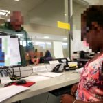
In order to understand the gaps between user needs and their current system, I organized passive observations of our user groups in order to understand their environment and identify any disconnections between what clients tell us and the reality of the user’s world.
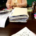
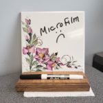
Taking notes of elements such as a simple whiteboard with the caption “Microfilm :(” spoke to users discouragement with their current tools. Even though these tools worked, and even though users could use these tools efficiently, they were out-dated. Users felt undervalued, as if they were not worth an upgrade in tech. Furthermore, the users’ work space was cluttered with sticky notes and sheets of paper taped to walls to remind them of important information. Users were not only constantly multitasking, but overwhelmed with the amount of information necessary to perform their job. Whatever tool I designed would have to manage this overwhelmed cognitive load, allowing them to not only quickly switch between tasks, but also contextualize important information.
Allowing users to walk us through their day, in the context of their own work space, provided empathy to user wants and needs. Our client could request certain products, but by speaking with users, I was able to prioritize and even discover new product opportunities which have served to improve users workflow and reduce the amount of repetitive tasks.
design
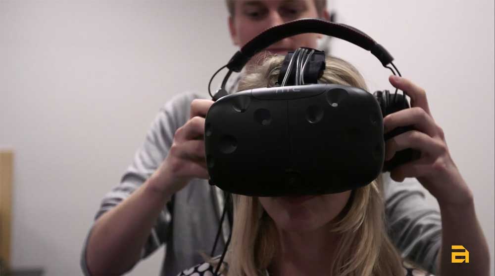
My work did not end with research. Each dive into research produced sketched wireframes. Sometimes these wireframes were done with users, other times these wireframes were created after reviewing research to propose to my Product Owner. I often created 3-5 versions of wires for the team to review and critique. After multiple iterations, I would finalize these wireframes in Axure. I then used the Axure wireframes as interactive tools to test with users. These user tests might be in the hallway or at the user site depending on the risk of design, time restrictions, and user availability. Though I cannot share finalized designs, I can share some of my sketched wireframes.
Additionally, as my project was without a primary designer for 2 years, I created an updated style guide paired with research documentation which better matched developer needs. This style guide lived in Figma based on Google Material Design, and would update depending on updates within Material and new user needs. This was important as Axure could not properly replicate Google’s Material Design, so it acted as a bridge between wireframes and finalized design. Team members who wanted to see the thought process and reasoning for design decisions could also refer to the style guide notes.
personas
As a government project, there were approximately ten personas, which I not only updated and created based on research, but also juggled and balanced between products. Admittedly, ten personas can seem like too many, however, for a product that had to meet the needs of both government employees and the public, it was necessary. Personas were not only key to ensure that each product met the needs of its primary personas, but also used to investigate who benefitted the most depending on each product.
I discovered that were three primary personas, two of which shared many roles, and one of which was pivotal to the effectiveness of everyone as a whole. If this primary persona were given additional support to optimize their process, the other two primary personas would have more time to focus on more critical tasks. Focusing on this one primary persona, I identified a new product opportunity, which is already improving the daily life of users.
story mapping
Multiple applications created a need to ensure that the entire project told a cohesive story for each persona. How would users discover new applications? How would they navigate between each application? How would the applications connect with one another? Each product needed to work independently, while also acting as part of an ecosystem. I created a story map for each app to keep not only the research and design on task, but also to demonstrate purpose and value to the client.
comparative research
Though my client was the government, they still had competitors on the market. To understand the competitive landscape while comparing visual and language styles, I constantly researched other similar tools on the market. This allowed the team to discover new opportunities and ensure our products were cutting edge. This also proved our own product’s unique qualities against its competition. I used this information when meeting with potential new users, gaining our client new customers.


