ui challenge: create an app
In order to develop my Sketch skills, I began designing what my dream product would look like: the app for a Bionic Pancreas. But what, what’s a bionic pancreas? And why would I care about that?
Well, a bionic pancreas is a continuous glucose monitor paired with an insulin pump to deliver real-time insulin and blood glucose readings. Blood glucose is the amount of sugar in a person’s bloodstream. Insulin decreases the the amount of sugar in a person’s bloodstream. Blood glucose increases depending on a person’s hormones and how many carbs they consume. The target audience for this is insulin-dependent diabetics, with the secondary audience of friends and family who want to help their diabuddy in case their blood glucose drops too low, which is life-threatening.
Why do I care? Well, I am a type 1 diabetic. This is the technology I have been waiting for, so until this technology exists, I’ll design it.
The first thing I worked on was an icon. When working on icons, I make a variety of sketches before playing with colors. These colors are then used throughout the app.

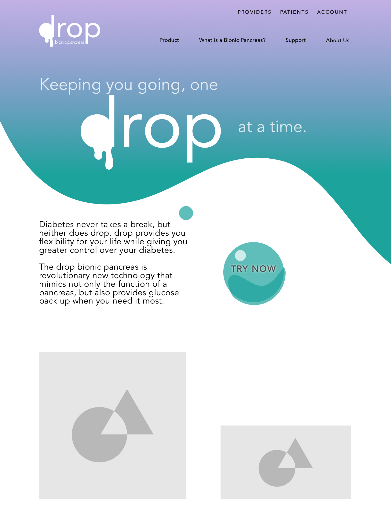
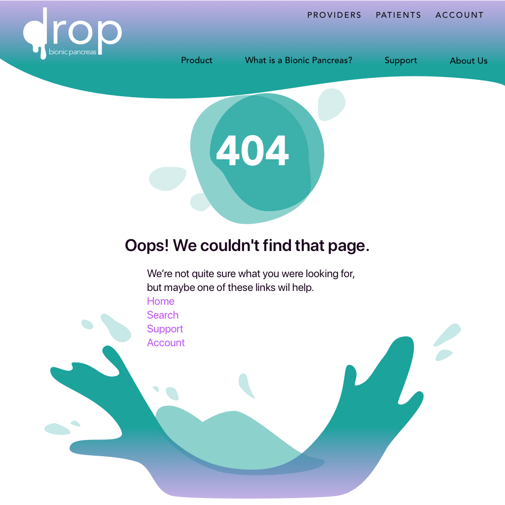
A splash page, & a 404 page just to follow the challenge’s suggestion. Users would find the product through searching online, not through the app store.
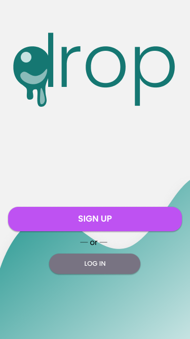
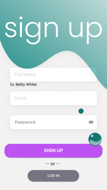
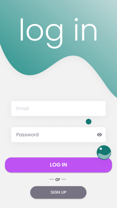
Still just dipping my toes: a sign-up & login page. With sign-up, I specifically chose to not use separate fields for the name, following current trends of one-field names. You can see the color contrast changed here to adhere to AAA Accessibility standards.
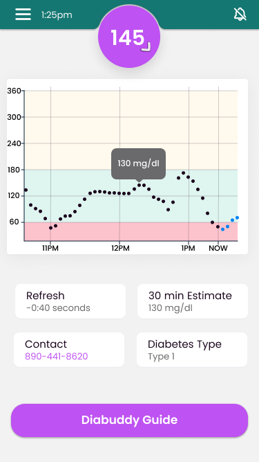
The primary view of this would be a view of the user’s blood glucose, as this is the primary concern of us diabetics. The design is a fresh take on Dexcom’s current view. In addition, this considers the potential of alternative color schemes & night-time views while still keeping AA-AAA Accessibility.
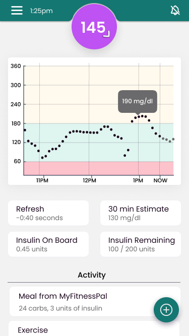
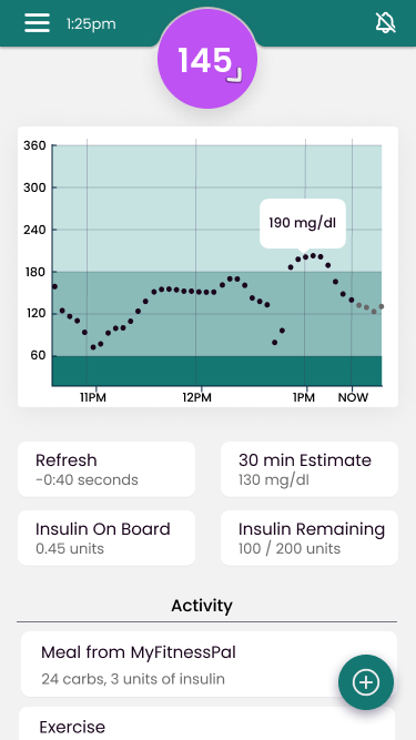
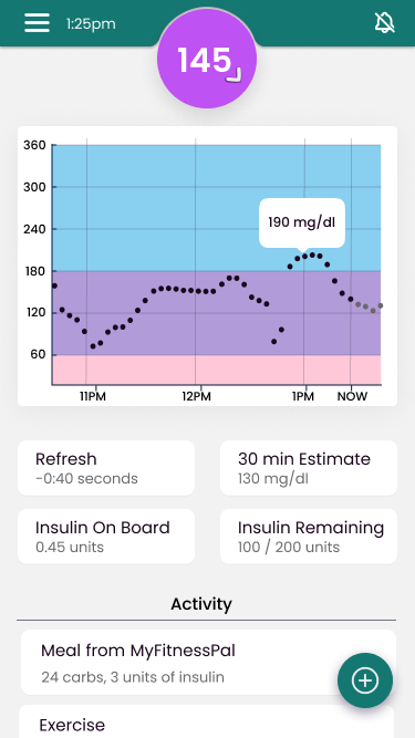
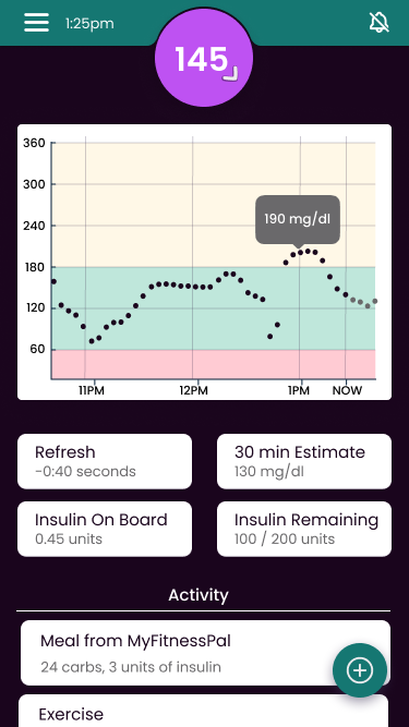
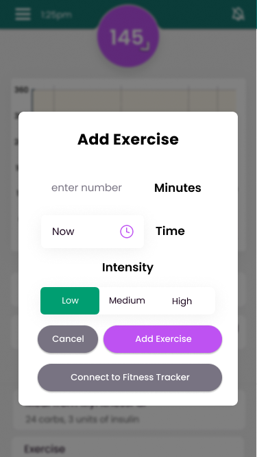
This view shows how a user would add exercise or carbs to their smart insulin pump system.
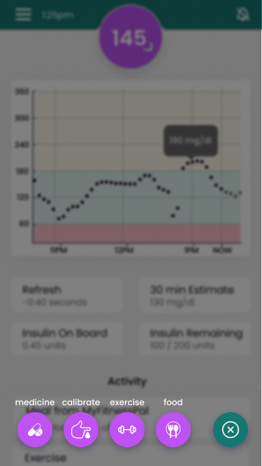
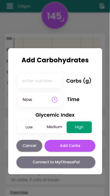
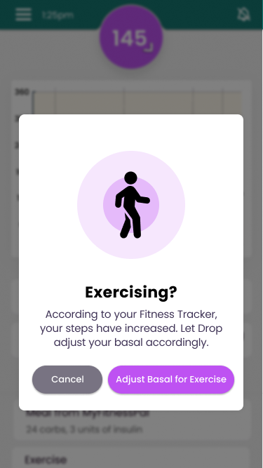
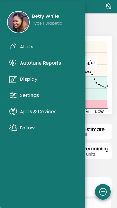
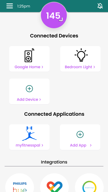
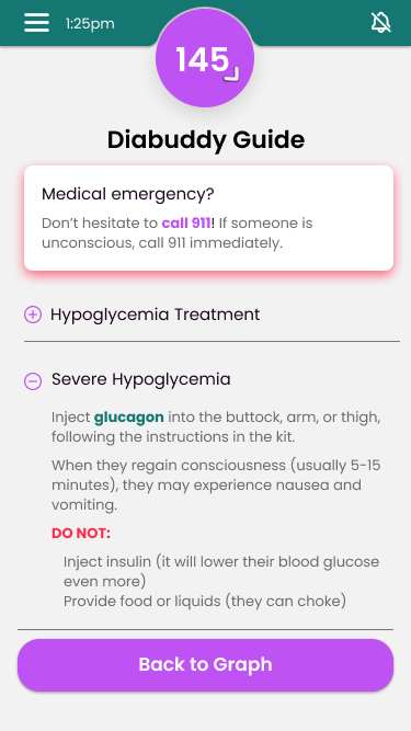
What about people who are deaf? What about those who want an extra warning when they go too low? Connected devices would put diabetics & their diabuddies at ease.
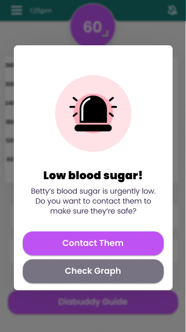
Diabetics require a support group to be their best selves, and oftentimes, if low, diabetics may find it difficult to help themselves, especially if they dropped in their sleep. This view is for followers, the support group, to keep and eye on their diabuddy’s blood glucose levels and contact them if necessary.
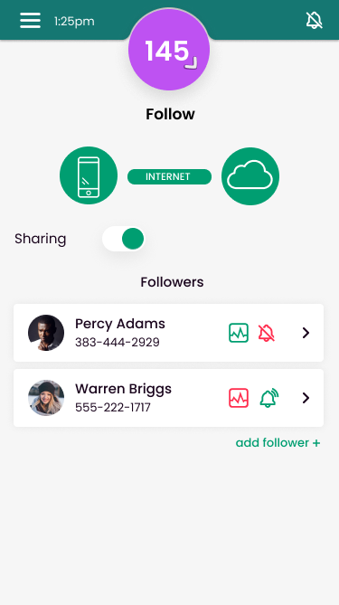
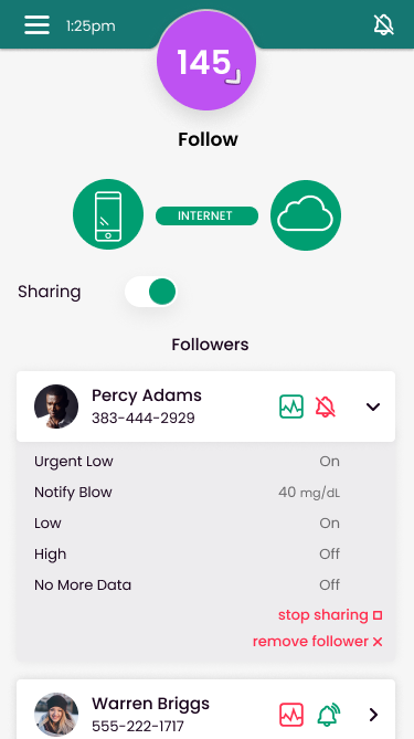
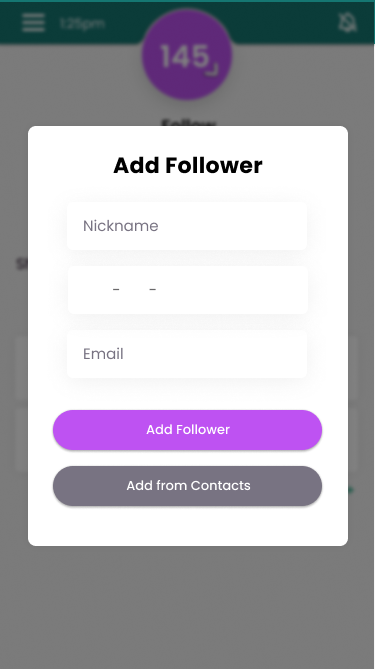
For that support group to exist, a diabetic would need a way to add followers. Here is how a diabetic would manage and add followers to their account. Certain settings, such as what kind of alerts the follower receives, are set up by the follower, and thus not customizable on the diabetic side.
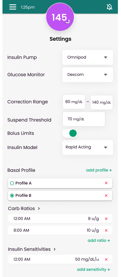
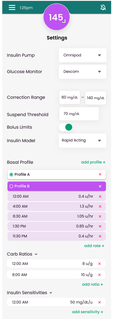
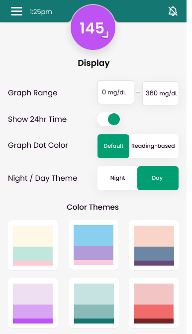
In the end, this device is extremely complicated, thus the physical device settings were a challenge. How can these complicated & extremely important settings be designed in a way to not overwhelm a user while also giving an appropriate amount of detail? I constantly redesigned & tested wireframes with fellow diabetics before settling on the current high-fidelity design.
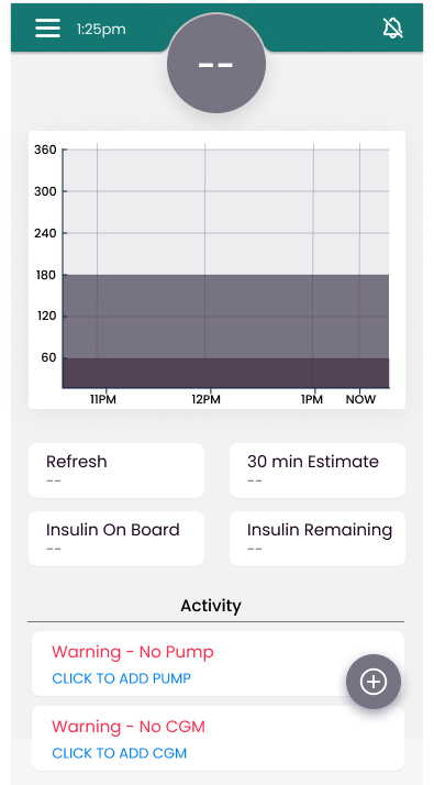
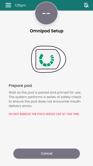
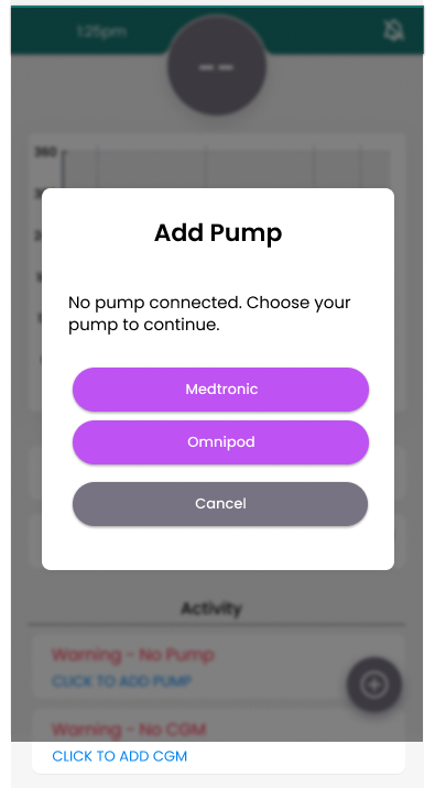
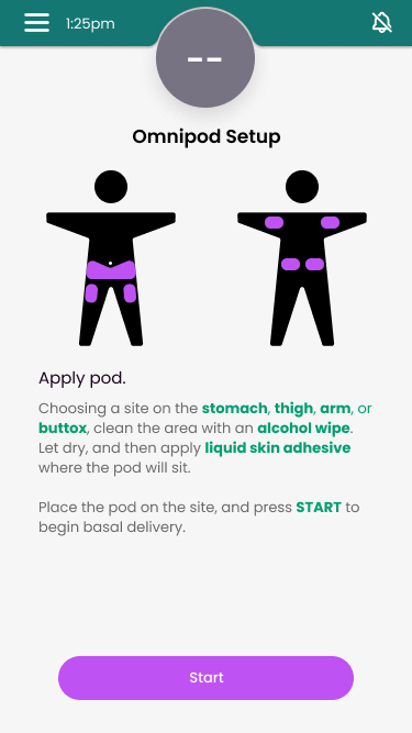
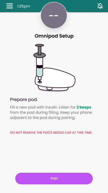
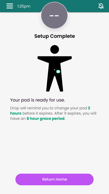
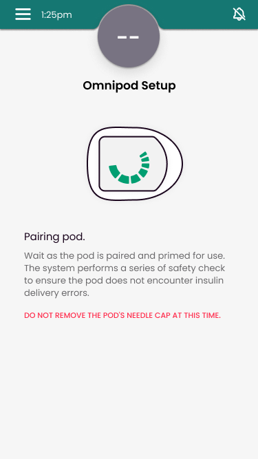
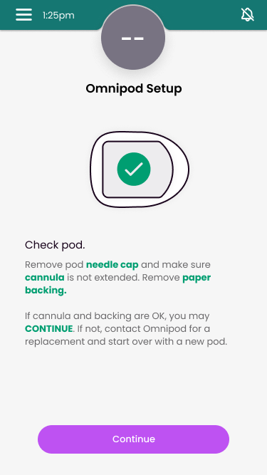
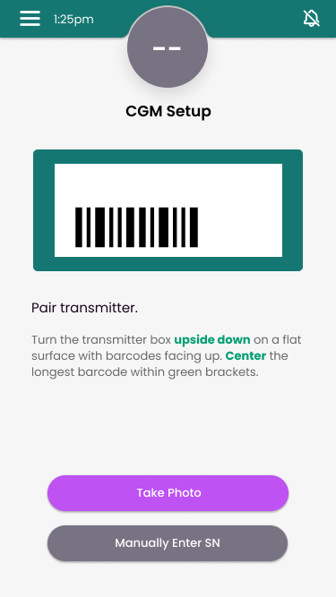
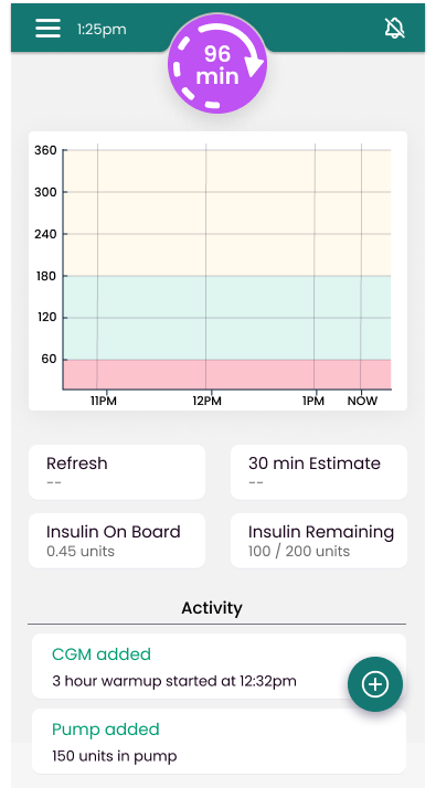
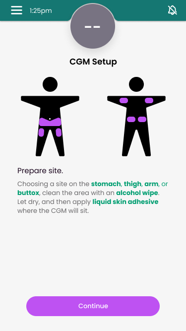
What would a bionic pancreas be like without an insulin pump or continuous glucose monitor? Displayed here is the flow from no pump or CGM to added pump & CGM, with a CGM warm-up time (currently required for technology.)
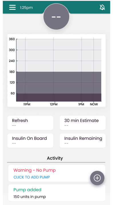
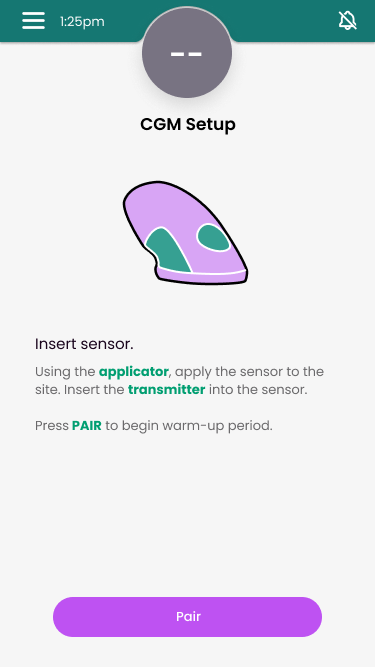
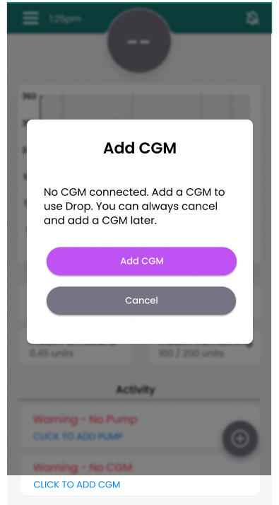
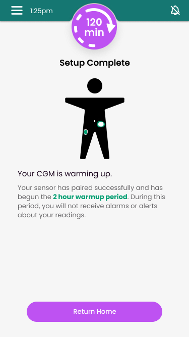
This details how users would re-order supplies specific through the app, with prices based on the user’s insurance information, which would be set up with a user account. This was created earlier in the process, using a color-scheme which I later abandoned in favor for a more accessible color scheme.

Diabetics & their loved ones can feel overwhelmed by relying on their phone, Making an app visible on a smartwatch is one way to minimize the impact diabetes has on their lives.
The following is the view from a diabetic user’s watch.

The following is the view from a follower’s watch.


